
Why Brand Colour Is a Strategic Asset - Not Just Decoration
If your brand colour could be swapped with a competitor’s and no one would notice…
you probably don’t own it.
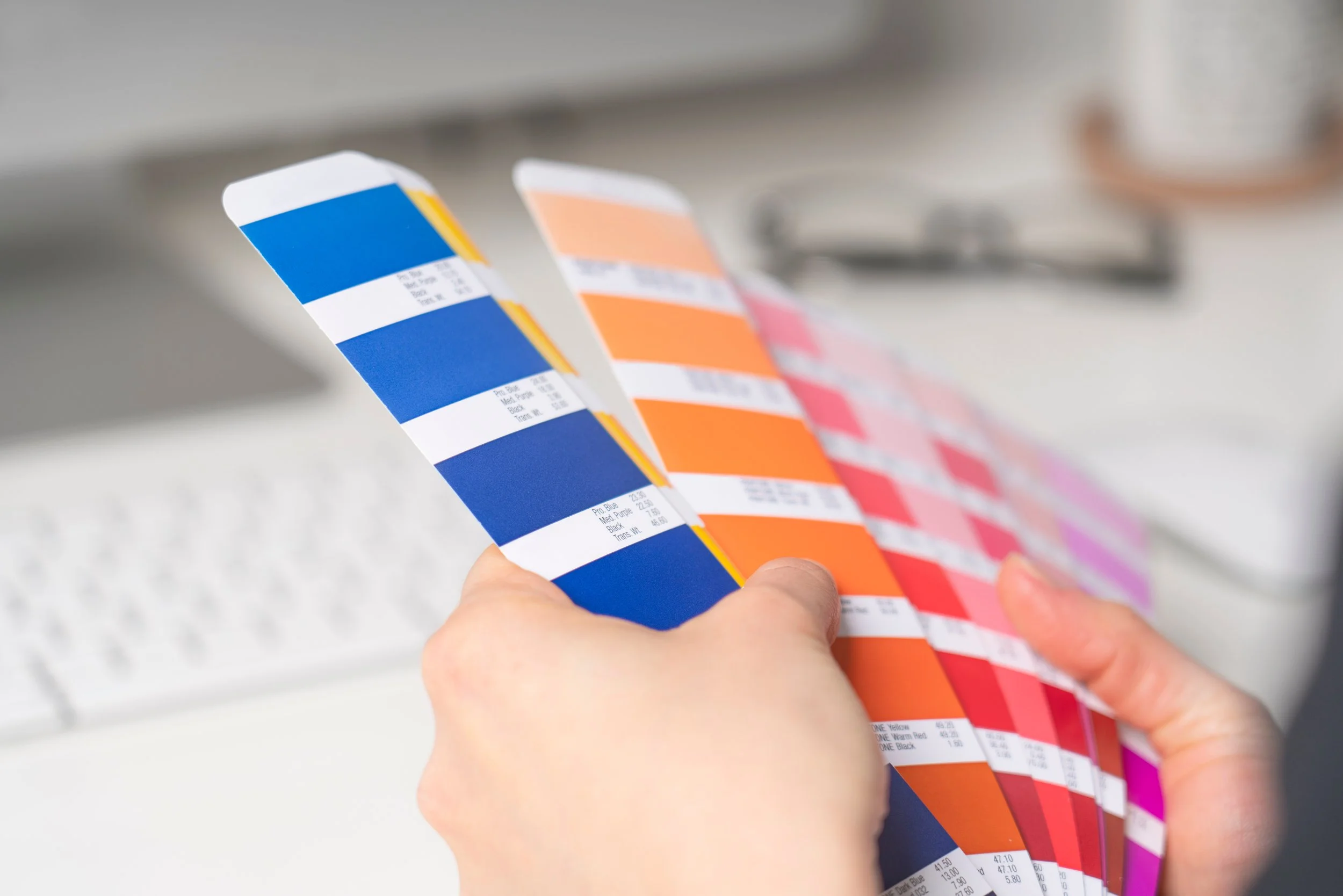
Colour is often treated as decoration - something to make a brand look appealing or contemporary. But in reality, colour plays a far more strategic role.
Colour is territory.
The most successful brands don’t just use colour. They own space with it. When used consistently and confidently, colour becomes one of the fastest signals of brand recognition — often before a logo, name, or message has even registered.
For growing companies especially, this matters more than most people realise.
As brands expand into new markets, categories and audiences, colour can either reinforce recognition or create confusion. Done well, it becomes a powerful asset. Done poorly, it blends into the noise.
Here are a few examples from our work at TWIN-Associates:
Full Circle: From Art School to Building Brand Systems
Years ago, seasoned creatives and designers would nervously glance over their shoulders at the next wave of talent emerging from the UK’s art schools - wondering who might soon be nipping at their heels.
Today, it’s AI that’s supposedly chasing us down for our jobs.
At TWIN-Associates, we see both differently. Not as threats, but as allies - forces we’re happy to walk alongside, or even get behind. Because without fresh creative thinking and emerging technology, our industry simply doesn’t move forward in ways that surprise us.
We believe in young talent. We believe in new tools. We believe progress sits at the intersection of both.