
An ecosystem of logos for a collaborative way of working - providing services to the people of Islington.
Fairer Together is Islington Council’s approach to working in partnership with communities in Islington, to tackle inequality and improve wellbeing through early intervention and prevention.
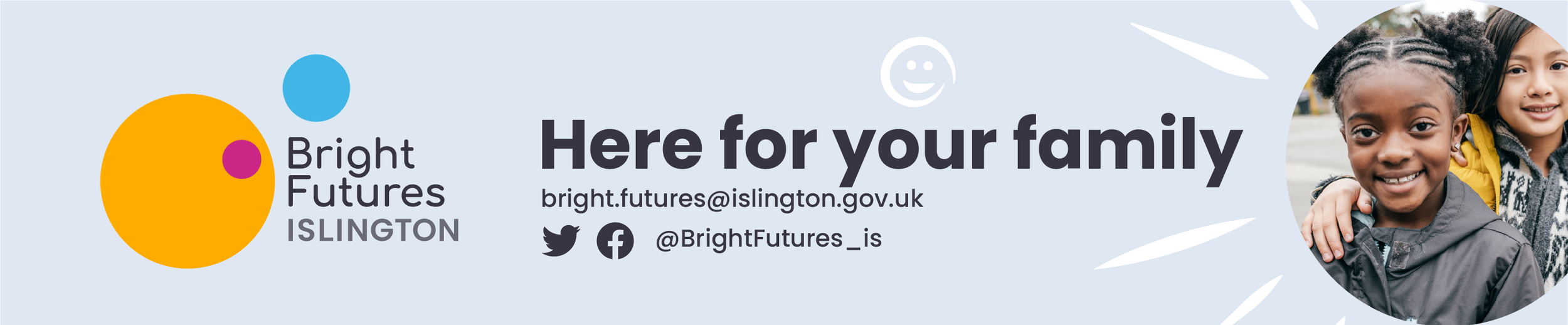
With the logo of Fairer Together established, as a circle, we built a system for all of the services the Council offered under that umbrella, defining each by colour and arrangement.

Building on the roundel, circles become a warm and recognisable motif
The Fairer Together logo, as a circular marque, acts as an endorsement badge, whilst the visual identities of FT and it’s resident facing services lean into the use of circles in vibrant colours.


Building on ‘Bright Start’, we create the ‘Bright Services’.
Bright Start already existed, and worked well as a positive brand name, so we built on this to create a connected service brand system with - Bright Futures and Bright Lives, taking residents from cradle to grave.