V7 brand refresh, motion package, ownable brand assets
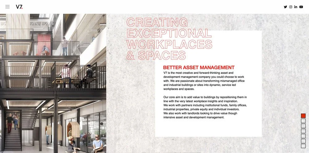
V7 is a creative and forward-thinking asset and development management company.
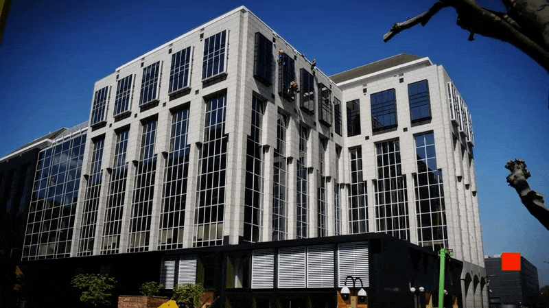
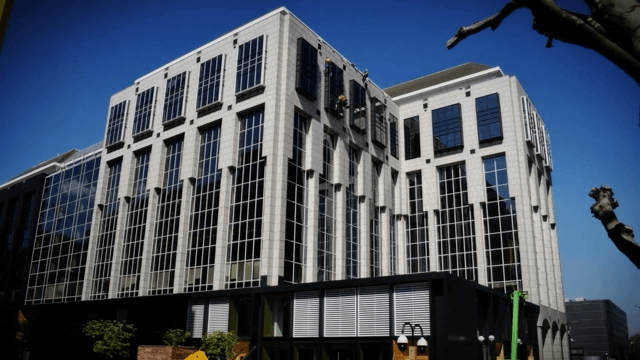
Passionate about transforming office and industrial buildings into dynamic service led workplaces, V7 wanted their brand to work harder for them.
When we met the tight knit team they had a strong and recognisable logo, but no other brand elements or consistent way of talking about themselves. We needed to build out from their marque and bring the brand to life making it engaging across all of the materials they use to win business.


Building on the existing brand
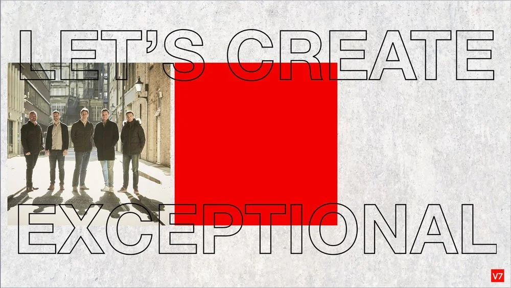
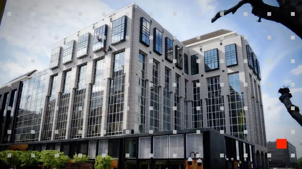
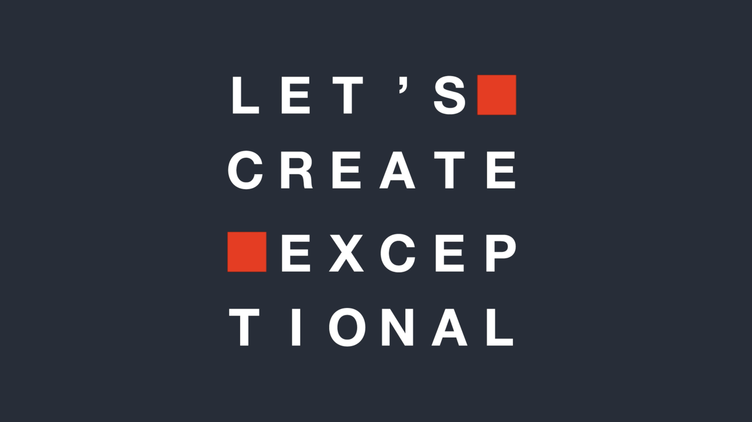
The logo’s ownable red square became the cornerstone of the brand kit, applied consistently as a subtle marque and activating to deliver the logo, tagline and information.
Keen to keep the crispness of a monochrome brand with touches of the brand red, rather than lean heavily on the colour, we introduced a concrete texture as a tactile and architectural addition to the brand palette.
Introducing new brand assets
When we started working with V7 they really only had their logo, which meant they had no visual stand out when they communicated anything about themselves - they were being overshadowed by the development brands they worked to create.
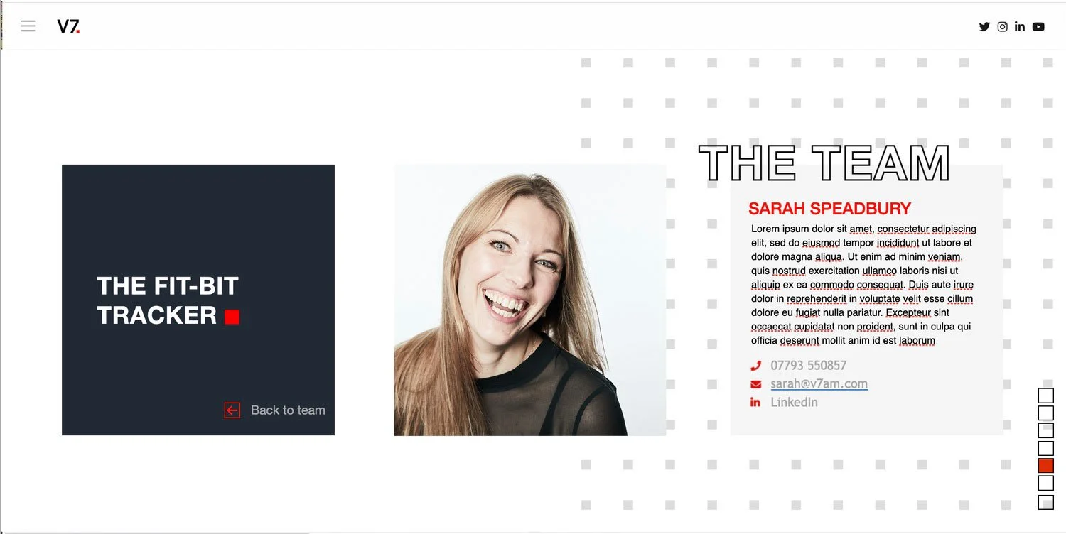
We brought to life a new set of brand assets - including heavier use of the square motif and tagline - to create a motion kit for them that could help energise their promotional material across client presentation decks and social media posts.
We also worked to produce a set of icons and infographics that helped them to explain their process and offer.
Strategy | Campfire Collective