HR tech brand Tellent brand relaunch renaming icon set
Helping Tellent, ‘The people decision platform’, evolve it’s brand to mark a significant shift in it’s business.
Working with key stakeholders on their brand architecture, with associate Laurence Honderick, TWIN-Associates facilitated online workshops, naming sessions and brand design forums.
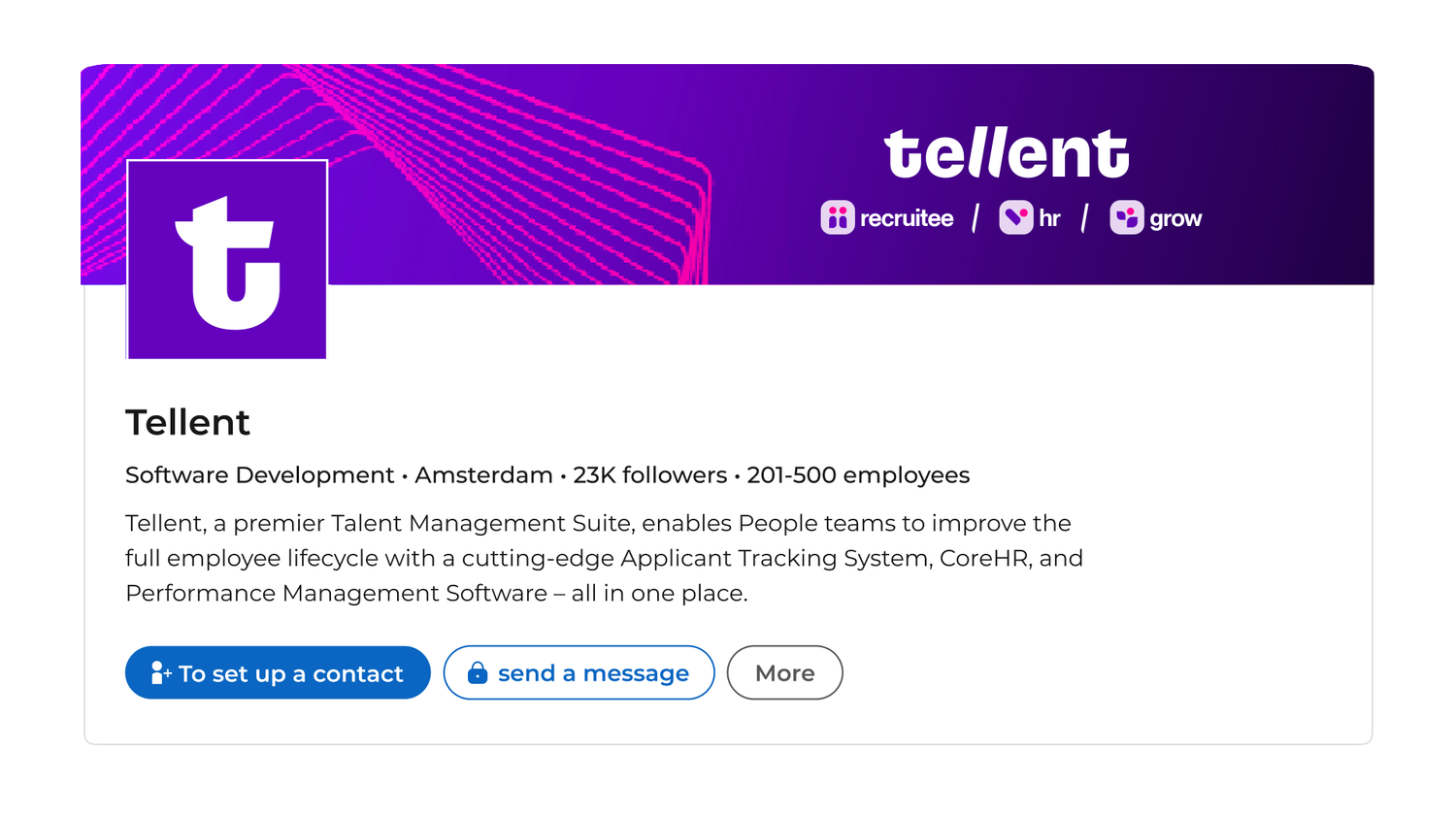
This wasn’t just a time to rebrand for Tellent - it was a complete refresh of the Tellent experience - streamlining processes, boosting efficiency and introducing a fresh user interface to better support it’s audience.
Our brand refresh and resulting icon and logo system needed to support this ambitious shift.

Reflecting the brand ambition
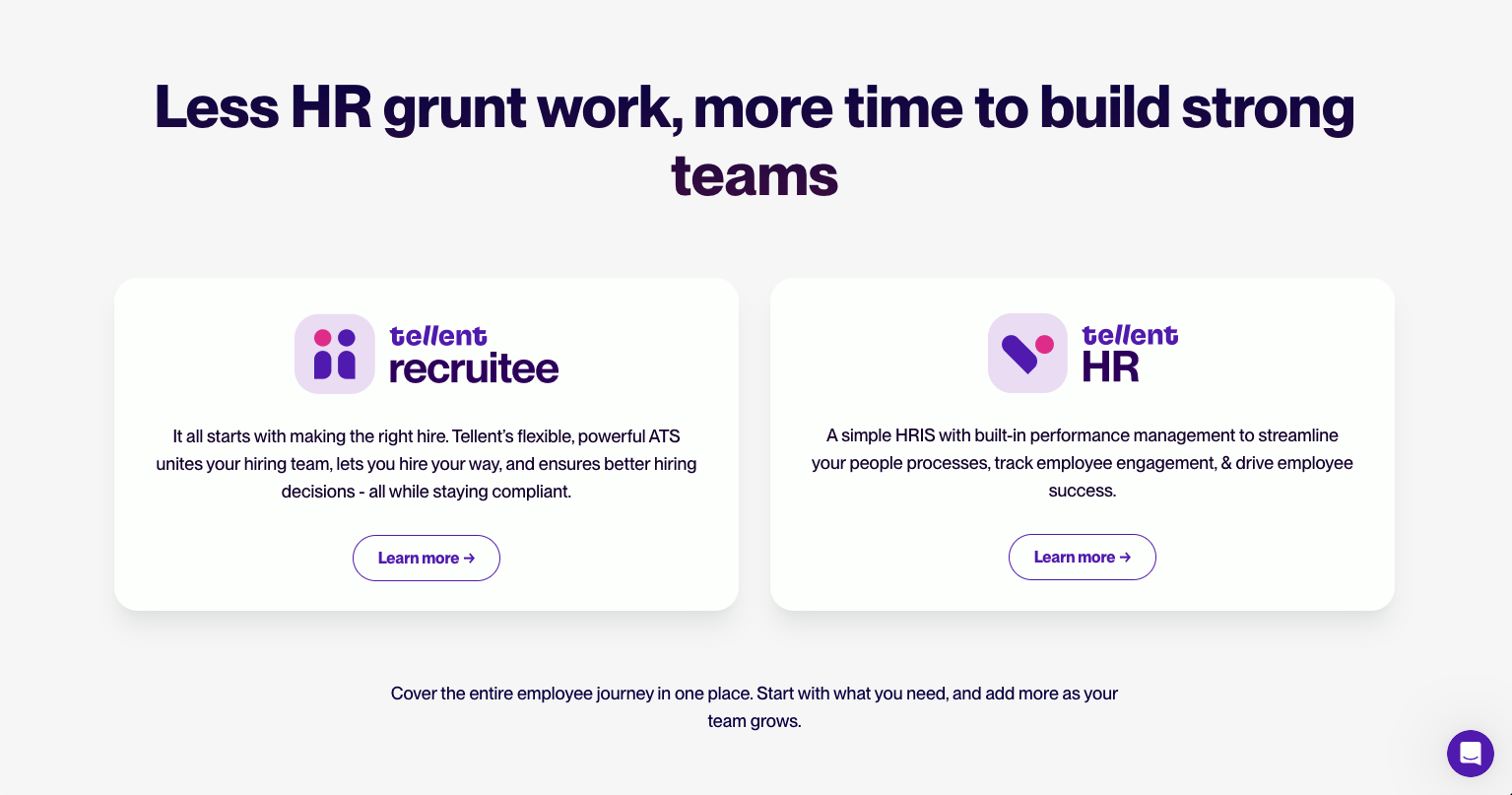
Tellent’s offer is a streamlined HR system bringing together disconnected tools into one platform, however having grown by acquiring a number of disparate sub brands over recent years, this was not how they were showing up.
The brands felt disjointed, something that was reflected in both naming and iconography.
We worked with the team, and Laurence, to tease out a more successful and unified collection of brand names and icons that all pulled in the direction of the masterbrand - this approach being future-proofed for further growth.
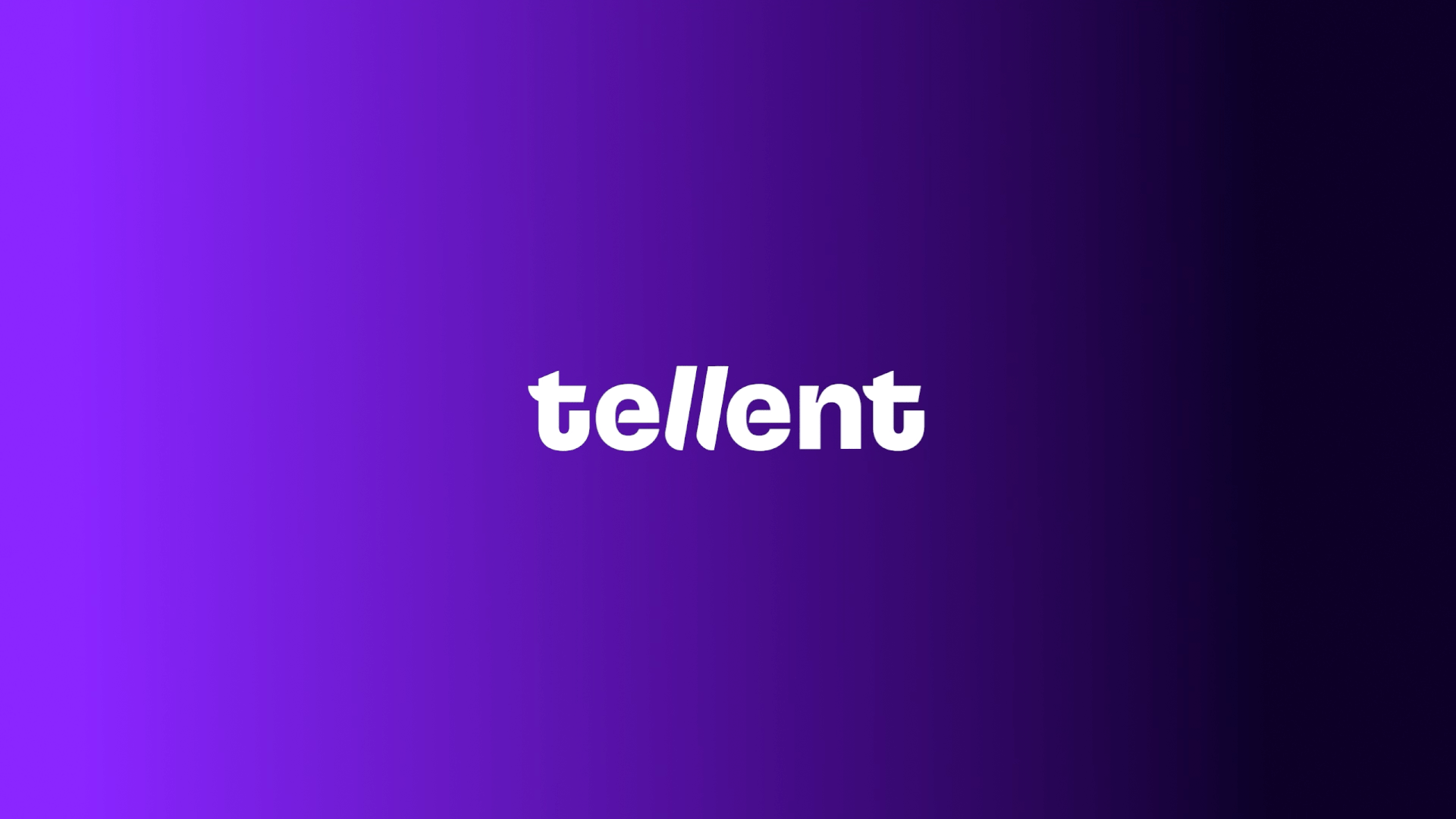
Purple reign
In the past Tellent had not had the confidence to use it’s brand colour in a bold and singular way; partly this was because they shared their brand colour with a significant competitor - not great for brand recognition in the market - meaning they often watered it down or added a myriad of other colours from the sub brands to help recognition.
As they planned to consolidate their product offer, we steered them towards a singular brand colour approach, with limited but effective use of the pink they’d used previously. Hello Purple!


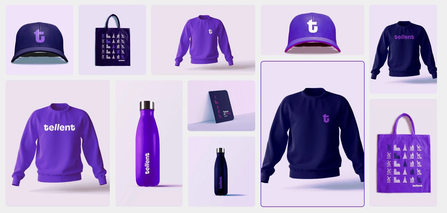
Consistency in communications
We furnished the team with an updated styleguide as well as a set of assets ready to launch; such as an icon set, animating logos, LinkedIn banners and more. Meaning that as they worked towards relaunch, the Tellent team could focus on the wider reaching business changes and interface design deployment.
Strategy Associate: Laurence Honderick